


- footerContent


![]()
528, Samseong-ro, Gangnam-gu, Seoul, Korea
Copyright © 2013 LiHOM-CUCHEN CO.,LTD. All rights reserved.

 |
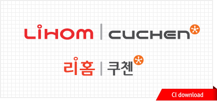 |
| We wish to express a strong will to become a leading home appliance company in both domestic and foreign markets by incorporating the two brands, which have made an eye-opening progress in each product family. | |
 |
|
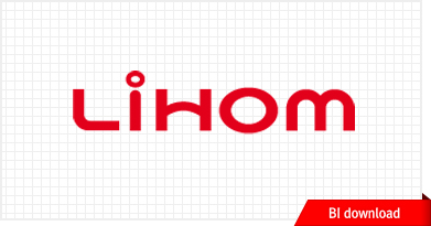
| 'LiHOM', consisting of the words ‘Living and Home’ or ‘利 [Li, which means beneficial]+Home,’ contains a meaning of stylish home appliances that contribute to a beneficial and advantageous life. The design of the word mark emphasizes warmth, flexibility and technology as a home appliance brand. A curve line in the middle of letter H reminds of maternal affection in which we felt during our childhood when mom covered a table with a table cloth. A circle motive is associated with steam and is engraved with a lowercase letter i. The basic color of the word mark is red, which symbolizes warmth and passion, demonstrates our prior responsibility for customer satisfactions. | |
 |
|
| CUCHEN stands for ‘Culture of Kitchen,’ which means our company’s will to lead healthy and eco-friendly culture for your kitchen. The design of the word mark expresses a modern brand image. The symbol resembling an Orange peel represents a perfect cuisine with a harmony of human, heart, ingredient, tool and technology to clearly represent our company’s identity as a kitchen appliance brand. The basic colors of the word mark are grey and orange. Grey represents CUCHEN’s trendy and modern sensation. Orange, which symbolizes health and energy, represents our responsibility to lead the company by introducing innovative and unique products to customers. | |
 |
 |
 |
|
| As a professional home appliance company, LiHOM indirectly represents warmth and sincerity in emotional aspect as well as high technology through Visual Identity. | |
 |
|
| A curve line in the middle of letter H reminds of maternal affection in which we felt during our childhood when mom covered a table with a table cloth. A circle motive is associated with steam and is engraved with a lowercase letter i. | |
 |
|
| In order to emphasize our products as a home appliance brand, we adopted a word mark strategy rather than a symbolization strategy. In consideration of a brand expansion as heat home appliances, we used color RED, which symbolizes warmth and love. | |
 |
 |
 |
|
 |
|
| CUCHEN home appliances explore a brand-new category in the field of kitchen appliances with a stylish and luxury image. Our company establishes a unique identity of CUCHEN by adding our eco-friendly core technology based on the keywords of user-oriented convenience and practicality. We consider our prior responsibility for customer satisfactions from the stage of product development to customer service. | |
 |
|
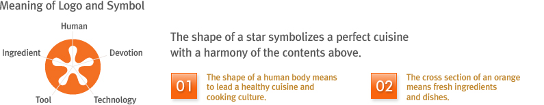
| CUCHEN is a new kitchen appliance brand, which has developed with ambition since 2004. Our brand represents ‘Culture of Kitchen,’ which means to lead a kitchen culture in Korea. The shape of a star with five points, which represent human, ingredient, technology, tool and devotion, symbolizes a perfect cuisine with a harmony of the contents above. The white star shape in the orange background represents a shape of human body, expressing our strong will to become a leading home appliance company. In addition, the cross section of orange represents fresh ingredients and dishes. | |


![]()
528, Samseong-ro, Gangnam-gu, Seoul, Korea
Copyright © 2013 LiHOM-CUCHEN CO.,LTD. All rights reserved.